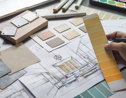
The onset of another year typically is accommodated by a sense renewal. That yearning for a fresh start will be greater going into 2022 as the last few months might seem uncomfortably too close to a repeat for some. Colors can help usher in the new year in a hopeful mood and even make the spaces we are spending more time in look more cozy, warm, and vibrant.
“As many of us know following a year of lockdown, the easiest way to shift your mindset is to change your environment. While we begin to trade sweatpants for strappy shoes, recipes for reservations, and a night in for a night out, our paint color preferences are shifting too, in both residential and commercial spaces,” said Amy Donato, senior color marketing manager, PPG paint. “DIYers, property managers, designers and architects are shifting away from the stark, neutral palettes of yesterday and opting for color in all forms. Call it rebellion, but we are certainly here for the resurgence of optimistic colors to guide us into a new era of home design.”
READ MORE: THE ECO-FRIENDLY PRODUCTS BUYERS WANT IN THEIR HOMES
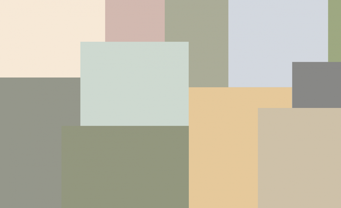
Valspar's Colors of the Year
Valspar's 2022 Colors of the Year provide consumers a wide range of naturally based warm colors that will not only help calm the nerves and boost the mood but also provide a confidence in what the future may hold. "Colors can power moods, energizing us with confidence, strength, and curiosity—allowing us to express ourselves with color anywhere—whether it be a full room, an accent wall, trim or furniture," said Sue Kim, Valspar’s color marketing manager.
Valspar chose not just one but 12 Colors of the Year for 2002, which are available at Lowe’s and at independent paint dealers:
 Blanched Thyme (at Lowe’s) – (Into the Wild at independent retailers) Calming and nourishing, this natural shade encourages a calm balance within yourself and your home. Design tip: Natural greens remain an important color to bring into the home as consumers continue to focus on their physical and mental well-being.
 Gilded Linen – (Ghost Story) Soft and cozy, this minimalist white gives you space to breathe and declutter your mind. Design tip: This color helps create coziness and helps a space feel more serene with added softness.
 Delightful Moon – (Oat and Honey) A color that radiates warmth, this shade has a new take on sophistication, expanding the natural tones we bring into the home. Design tip: Warm shades of yellow, reminiscent of honeycomb, accomplish an uplifting feel in a sophisticated way.
 Lilac Lane – (Sleepy Kisses) A fresh shade with beautiful versatility, soothing and restorative, it brings a new softness into the home. Design tip: Shades from the purple color family are associated with spirituality and creativity, crafting a space that promotes good mental health.
 Mountain River – (Flannel Gray) A natural hue with depth, feels like an indulgent escape within the home. Design tip: Deep and dark blues have duality. Used in small doses, they feel indulgent and luxurious. Used as an all over color, they create a safe space that allows you to escape.
 Orchid Ash – (Shady Lady) Pure and clean, the simple quality of the shade creates a mindset for a hopeful future. Design tip: Light and pure, cool shades shift feelings to the purity of the arctic.
 Grey Suit – (Pond Leaves) Dependable and reliable, this warm grey works well in any setting, in any home. Design tip: In a time of uncertainty, we are looking for dependability. The slight red undertone of this shade embraces the shift in temperature of colors being brought into the home.
 Subtle Peach – (Seven Veils) A simple pastel that brings us back to basics, its natural quality gives a lived-in attribute that feels clean and modern. Design tip: There is a beauty in simple colors that feel slightly lived-in, embracing natural pastel shades for their uplifting and calming qualities.
 Rustic Oak – (Dockside) A warm shade reminiscent of copper, creating a space for us to feel protected and comforted. Design tip: Evocative of shades from the 70's and 90's, this color is rooted in nostalgia, comforting to younger generations in uncertain times.
 Sunset Curtains – (Warm Alpaca) We have embraced warm neutrals back into the home for comfort, a familiar hue that is reassuring. Design tip: Tinted neutrals have comforting and tranquil qualities. The nostalgic feel of this shade is reassuring without being too overwhelming.
 Country Charm – (Garden Rain) Create a space to relax and unwind, with warm, comforting charm. Design tip: Neutral shades that feel slightly muddy provide a space to create our personal sanctuary. This shade feels relaxing but with a nostalgic charm.
 Fired Earth – (Moon Rock) A classic shade with warm depth, this shade evokes a feeling of stability and comfort. Design tip: Dark hues with a dose of warmth bring a newfound coziness, making us feel protected and comforted.
Sherwin-Williams' Color of the Year
After years of cool neutrals and bold jewel tones, Sherwin-Williams 2022 Color of the Year is Evergreen Fog, a nourishing and sophisticated gray-green.
 “Evergreen Fog is a sophisticated wash of color for spaces that crave a subtle yet stunning statement shade,” said Sue Wadden, director of color marketing at Sherwin-Williams. “Evergreen Fog inspires us to begin again and is a great choice for modern interiors and exteriors. The familiar, comfortable nature of Evergreen Fog shines as a reassuring backdrop and freshens up any space. Create depth and texture with a mix of natural-looking textiles. Add a little gleam with a fusion of metals — champagne gold, warm brass, or inky black.”
Wadden recommends pairing the hue with organic neutrals such as Shoji White, Accessible Beige and Woven Wicker, and tonal luxurious hues such as Urbane Bronze, Über Umber, and Bakelite Gold.
Glidden's Color of the Year
Glidden’s Color of the Year pick is Guacamole. This ripe avocado-green delivers crowd-pleasing  color that's both relaxing and refreshing. In a press release, the brand noted that online searches for green paint colors have more than doubled since 2020, indicating that homeowners are seeking colors that soothe.
"We've all saved beautiful green kitchens and earthy-inspired bedrooms on our Pinterest boards and TikToks over the past year and a half, driven by our need for calm, regrowth, and rejuvenation after living through these 'unprecedented times,'" said Kim Perry, Glidden’s paint color guru.
PPG's Color of the Year
A relaxed yet enticing green is Olive Sprig from Glidden’s parent company PPG. It is a midtone, neutral, lush green with an organic green undertone that emulated the feeling of  soothing aloe vera or a fragrant plant, brightening any space with organic liveliness. Lending itself to be paired with natural materials, Olive Sprig looks beautiful alongside unique architectural elements and furniture with curved forms to create a comfortable and grounded space.
The color can help create a sanctuary in a bedroom, encourage focus in an office, offer the perfect neutral backdrop in a retail store or restaurant, and create a grounded getaway in hotels. Olive Sprig also pairs beautifully with brass accents and wood tones on an island or lower kitchen cabinets.
BEHR's Color of the Year
 For BEHR, Breezeway, evokes feelings of coolness and peace while representing a desire to move forward and discover newfound passions. A silvery green shade with cool undertones. The color is inspired by naturally stunning sea glass found on the shore of salty beaches. Breezeway, is found within the BEHR Color Trends 2022 Palette. The 20-color collection consists of soothing shades and warmer tones including the timelessness of Whisper White and the bold terracotta red of Perfect Penny.


Add new comment