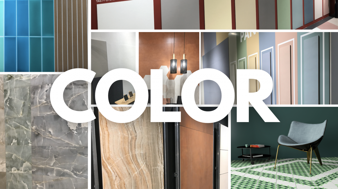
Few colors were completely left out of this year’s Cersaie entirely, but certain palettes stood out.

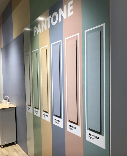
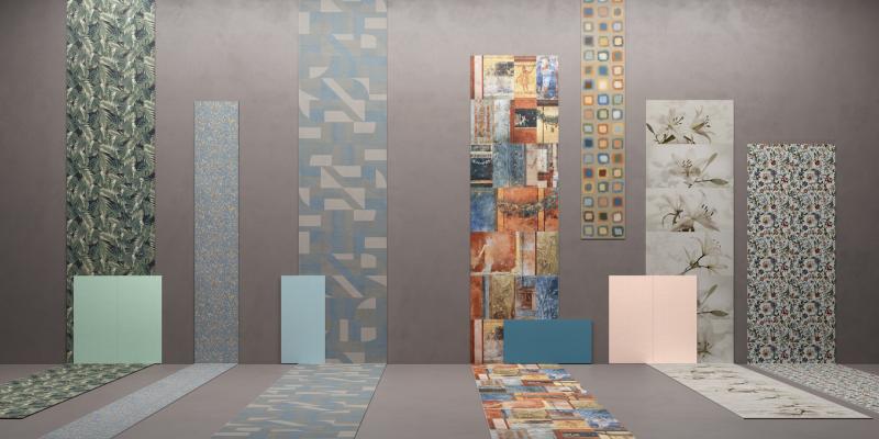
SIMPLE, SOLID, LIGHT
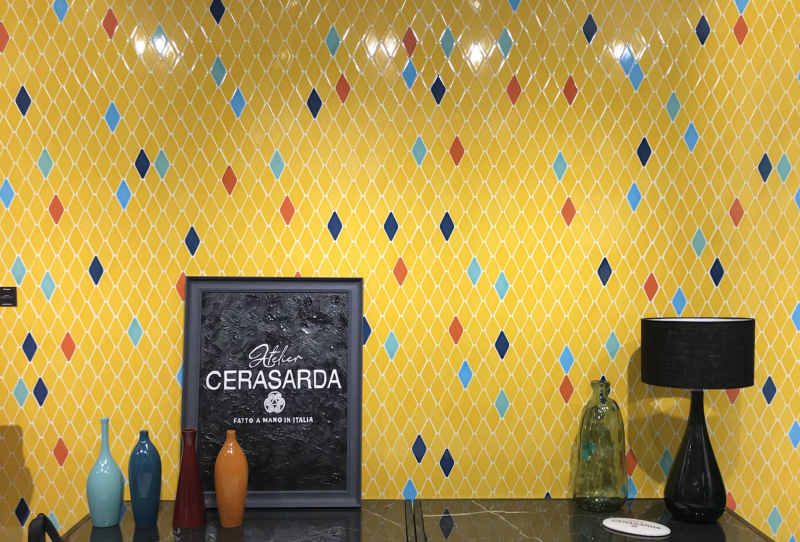
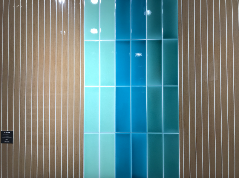
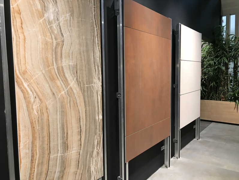
While rich, bold colors helped define the aesthetic of some of this year’s show’s most impressive showcases—like Cersarda’s Tintùri collection—more prevalent throughout the exhibitions was the incorporation of solid and though bright still often muted colors, many of the pastel variety. The trend was certainly apparent in the natural palette, which is “back in its most balanced, discreet spirit,” according to a statement from LaFaenza.
Tile from Panaria
Tile from Panaria
Tile from Mariner

NATURAL COLORS
The popularity of natural colors at this year’s Cersaie keeps going a trend that has been years in the building. For some manufacturers, such as Refin, the palette appears prominently across multiple collections. “At Ceramiche Refin,” explained Bedogni, the manufacturer’s communications and marketing lead, “we have decided to draw inspiration from the flawless imperfection of nature ... in all its power.”
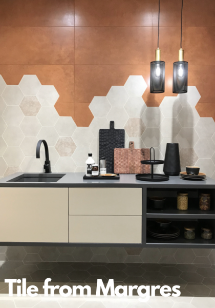
Tile from Margres
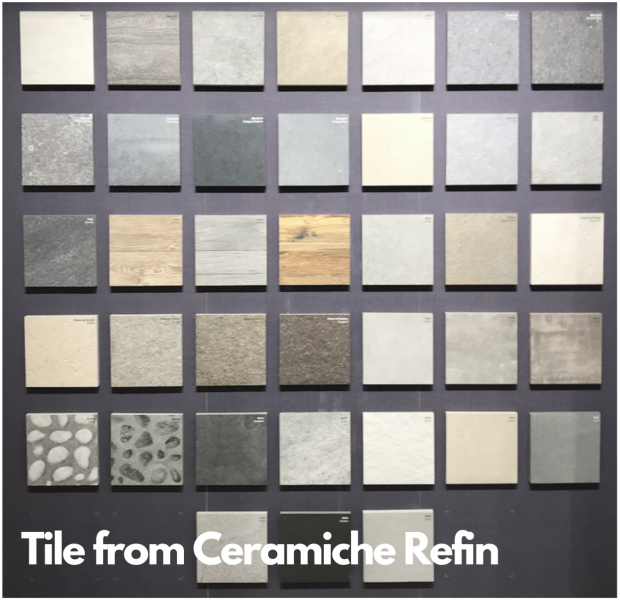
Tile from Ceramiche Refin
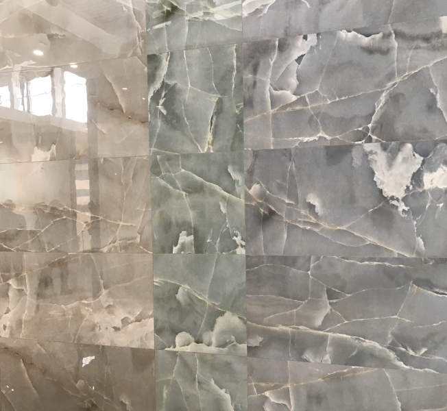
NATURAL COLORS: Blues and Greens
 The term “natural color” is admittedly ambiguous and vast, describing generally neutral, muted shades of grey, slate, beige, brown, sandstone—basically any color that may appear naturally, or at least appear to appear naturally (i.e., typically nothing too rich or too vibrant). And while manufacturers have and continue still to draw from that vast spectrum of colors to create appealing homescapes, two “natural” colors stood out this year in particular: blue and green.
Call it a collision of the more typical, stone-influenced natural palette with the surging influence of biophilia—which in design tends to favor hues of greens and blue—or call it a modern redefining of the natural palette in general. However it’s phrased, the fact is that manufacturers are leaning into the trend, leveraging the colors in a variety of styles.
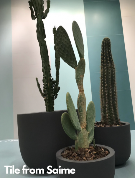
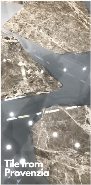
The aforementioned Tintùri collection from Cersarda features heavy amounts of greens and blues over slick finishes as does its Yacht Club collection, while Provenzia, a brand of Emilgroup, worked hues of the colors into both its heavily textured and onyx tiles. In fact, stone designs like marble and onyx are perhaps where the uses of green and blue were most obvious, as it’s a relatively novel combination. Though, that may not be obvious from the number of manufacturers showcasing the style, which include designs from Saime and Versace Ceramics—the latter of which produced a tile mimicking the vibrant colors of lapis lazuli.
Tile from Cersadra, Tinturi collection
Tile from Cersadra, Yacht Club collection
Tile from Ceramica Vietrese
Tile from Gardenia Orchidea
Tile from Saime
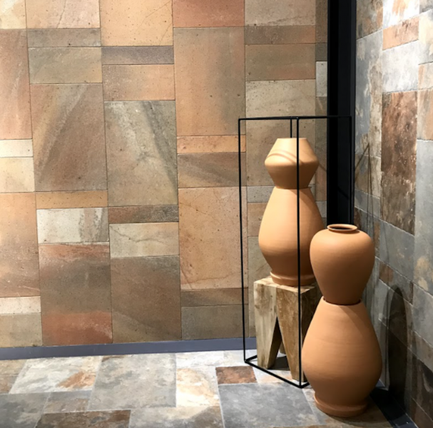
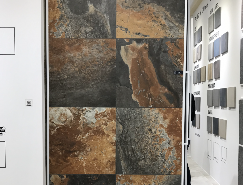
 NATURAL COLORS: Terra Cotta
Another stand out from the natural palette this year is terra cotta, which appeared in a wide variety of interpretations from the deep, muddied almost wet look achieved by Margres to the dryer, paler tones produced by Imola, to the simple, solid “muted clay” color featured in Ornamenta’s arched tile collection—which the company described as an exploration of “the history of italian ceramic manufacturing with a dynamic and contemporary design approach.”
Tile from Imola
Tile from Gambini Group
Tile from Dordini


Add new comment